Musing about Artistic Styles and More

Hey, y’all I’m Lady T. and I make the New adult fantasy comic MagicalMashup!

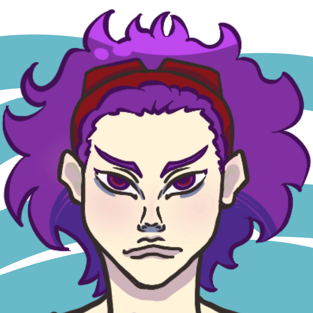
I’m sure most artists have contemplated what it means to have a style and how it can be developed at one point (or now). An artist’s style is usually easier to notice when it’s someone else’s over our own, but some of us are more conscientious about what we make so maybe not. This got me thinking about when others realized they could characterize their styles as something uniquely theirs and that it includes my own.

Art timeline for me that is all over the place tbh

I saw a quote on Twitter by user @Taijuey who said: “I think part of developing a style is admitting to yourself that you just don’t like doing certain things.”
This got me thinking about my own artistic thumbprint. For sure it’s a combination of things as I started drawing because I really liked anime and wanted to see my own characters brought to life outside my head that evolved into being the change I want to see in the media i consume. I remember how easy it was for me to draw faces, but bodies took me for a loop. As I grew as an artist, I tried to draw more varied subjects and that’s when things started getting interesting bc I realized there were things I just didn’t like drawing and I would be avoiding them as mush as possible to focus on what I did like and that shaped how my style developed over time. I just really like faces and shoulders y’all ok!!

As an artist, have you ever had that moment when someone you’ve known for a while looks at your art compared to another artist and can clearly tell which one you did? That’s style recognition, even if it’s not where you want it to be yet. Then they said something like, “Ah yes, I can tell you made this because it’s totally your style.”? Only to have you realize…OH SNAP, I HAVE A STYLE!? Then you try and figure out what they meant by “your style” and you ask what they meant, and if you were lucky they could form their thoughts into words and you gained some insight about yourself, but if they couldn’t be precise you just scratched your head and tried to reflect on your own? I know my experience can’t be singular lol.

The first time I heard this was in high school from one of my geeky art club bodies who said, “Ah that’s so H-Queen” (at the time my nickname was H-queen, but that’s a whole other thing pft). I didn’t think too much about what he said as I felt like my work was pretty generic in comparison to theirs, but even then there were things I would do in my art that made it pretty obvious that I was the one that drew it, but it took a while for me to notice that about myself.

Did someone say color

Style isn’t just formed by how you draw, but also what you draw and the themes you use in the work you make. I’ve always been into drawing intimacy, cute moments, going against gender roles, and subverting what a main character should look like. Over the years that has turned into my focus on the diversity of women’s bodies in art, though I admit my male forms aren’t nearly as diverse I can at least understand why I developed this way. I made the deliberate choice to focus on the underrepresented ways in which women can manifest in media and bringing that to the forefront of my art as it was hard to find. I saw more diversely bodied males growing up over females in cartoons, comics, movies, and all that good pop culture stuff in between. Though times are a changing abs there’s is more body diversity rep going about, the intentional drive to do my part is engrained in what I like to draw and how I draw. I totally want to keep expanding my inclusion net though, ur my foremost goal is focusing on the change I can make with what I like to create most.

More things change the more they star the same

Other things I’ve learned about my style include my fondness for round shapes. Even if something is supposed to be seen as rigid or at a sharp angle, I always find my hand naturally adding a curve. Another thing I’ve noticed is I don’t draw a lot of bangs on my characters which is interesting considering the foreheads I draw are pretty small in comparison to the rest of the face. I also love larger-than-life hair. Like, c’mon, have y’all seen my protagonist? Totally in line with this observation and the co-protagonist has gained more volume over the years as I started to challenge myself more by drawing shorter hairstyles that weren’t just a bald head.

(back in the day Kaelen’s hair was so flat pressed. Couldn’t be standing next to my girl with hair that bodyless lol). I still tend to go for longer hairstyles over shorter ones as I find those more fun and easier to draw, I admit I don’t like drawing short hair as it’s actually pretty hard for me (don’t even get me started on facial hair).

One psychedelic trip to the future pls

Through analyzing the things I like to draw and what I don’t like to draw in comparison to my body of work there are a few things I’ve come to know about my art style as of today. It’s playful, kind of trippy, filled with organic forms, fluffy, bold, sensual, carefree, and dare I say fantastical!

Anywho what are some observations y’all have made about your own styles you can dish on mine if you’d like too? Can you describe your style if asked or are you still trying to figure it out? Do you consider your self style less? Are you interested in hearing what others have to say about your style? Feel free to add a small collage of your work (preferably one image with a few pieces of your work pasted next to each other, but if you can’t do that, posting 3 or 4 pics should do fine too) and indicate that you are interested in having your style described by anyone in the forum.

TLDR: Through thinking about artistic styles and being told I have a style after trying so hard to define my style, I was able to learn the components of what my artistic thumbprint is that makes up my style. For me, it’s the inclusion of subject matter, what I enjoy drawing vs what I don’t, and how I found ways to accentuate what I like. Tell me about where you are on your stylistic journey and if you don’t know, post some of your work and see what others have to say.

💜Lady T. 💜

Diversity in Comics

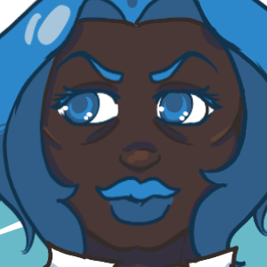
Some examples of the characters features in my webcomic MagicalMashup! and all them beautiful skin tones!!

Hi, y’all fellow creatives and musers of the world!

It’s Black History Month, but there is always time to talk about diversity in my book. I make a comic called MagicalMashup! that features a black female protagonist who is also fat or plus size if you prefer, I’m fine with fat as it’s just a descriptor and it is what it is, but I’ve noticed a difference in tags for fat and plus size so yeah… cover all grounds… (body diversity is a whole other can of wigglies that I’m sure I’ll get into at a later date). My cast is also filled with a host of other racially and ethnically diverse characters too with sexualities as beautiful as a rainbow as I draw inspiration from my life. As it is a fantasy setting, the ethnicities are all fictional, but racially speaking I pull from the real world for some relatability and representation. Today I want to talk specifically about characters in our stories and that we draw/illustrate/write that are not white.

As a creator of any racial/ethnic group, do you make black characters or other racial identities that aren’t white and based on real-life people of color for your stories or illustrations? If you do, what leads you to do this? Fill free to share pics of your characters. If you don’t, why not? Are you interested in diversifying your cast or writing?

I think it’s important to look at these types of questions and think about them in earnest and face them head-on as story creators and artists so that we all grow and expand our horizons about each other. I am aware that some folks live in racially homogenous areas so thinking about other races isn’t something that would cross their minds regularly or if you only tell stories based on your life and have never come into contact with someone of another race that would be included in your personal tale, but if you have access to the internet and partake in social media it isn’t hard to come in contact with the diversity of the world and this is about promoting and encouraging that contact.

I thrive in creating works based on fantasy and sci-fi and those two genres are where I like to spread my wings. Growing up much of my exposure to these genres was through white lenses and oftentimes black characters and other racial minorities would be cast as tokens and stereotypes. Even if I didn’t really connect with them, I appreciated them for existing when they showed up in those two genres specifically (Sci-fi had more rep than fantasy for sure though). It’s hard to notice how the things we consume growing up can impact us down the road, but craving representation in the fields that I adore is such a driving force for me that It got me to create art focused around the type of characters I wanted to see (and still do).

I’m not here to accuse or police anyone’s work and I can only speak from the experience I have as a cis black woman living in the USA who is tall, and fat has had a run in with cancer, and often mistaken for a drag queen (no shame in that game as DragQueens are beautiful and extra and I love them, but gotta keep it real as can’t talk about that life from persona experience), but I am curious to know the thoughts other creators have when it comes to racial diversity in their work (which is different from ethnic diversity as racial specifically means physical traits for how people look [skin color and features] while ethnicity is more based on culture. These two tend to go hand in hand, but not always, to be honest, there are more nuances that go into even that so it can get a bit eye-crossing for folks who fall into mixed groups or folks that fall into other groups). For example, my race is Black which gives a basic description for how I look (emphasis on basic), my ethnicity is African American when I fill in paperwork, but I’d put Black American if it were an option as unfortunately I nor my family have had any cultural ties to Africa in generations due to slavery and the loss of any records of where my lineage comes from before my great-grandma. Being Black and American is what I know and there is still more to me than that, but I think you get the gist of what I’m saying.

I started off just doing skin recolors of favorite cartoon characters and making OCs off of them as I didn’t understand the nuances of the differences in illustrating racial groups, but through anatomy studies and people watching (an ongoing learning experience for life), I have been able to apply that to my character designs to make more racially distinct-looking characters. Observation and studies are something I recommend any artist do, and if you are a writer, this also helps when being able to describe your characters with a flair that doesn’t always center around a type of chocolate or food (I love my sweets too, but the verbiage for dark skin is as wide as the sea is vast so don’t be scared to expand form that). There are tons of fabulous resources on writing with color and this is one that I recommend, but there are many more out there, and if you know of any feel free to share 🙂 https://writingwithcolor.tumblr.com/FAQ.

TLDR: Do you create characters that are Black or other racial identities (different from ethnic identities) that aren’t white? if so, how/why do you? Feel free to post examples of your characters of color. If you do not, how come and would you like to? Any resources for creating with diversity in mind are welcomed as well!

Checkout the post on the Tapas forum foe more replies!

https://forums.tapas.io/t/diversity-in-comics-novels/54792?u=lady_t_musings

Favorite Tools of the Trade: Pen Edition

Hi y’all!

It’s freezing down here in the south and I just want to be in bed with a heated blanket. Anyways, I may be cold, but something that helps take my mind off of not feeling the best is looking up and trying new art supplies. One of my fav places to scope out and test new supplies is JetPens. They provide extensive reviews of all the drawing and writing supplies that they have for sale. Not only that, but everything is OPEN STOCK!! That’s such a big deal. You artist know why ;). Just to not be that one for those that don’t get it though, it means you can literally buy 1 of any pen or pencil/accessory. Try before investing!! That’s such a big deal when trying to figure out what materials you even like to use. Not only that but if you run out of one thing from a pack, you can buy just what you need. Ultimate customization!

Pens pens and more pens! Checkout my book pouch too hehe.

I wanted to share some of my favorite Pens that I use for making comics and why I dig them so much.

That tip is nice for being fast and keeping it loose!

For Work

Pentel EnerGel .35mm ball Needle Point pen (black). This pen has become my favorite pen to do quick sketches within my Notebook. It has sharp lines and great for cross-hatching and tiny details. My handwriting isn’t very legible with it. but that’s not what I use it for.

I’ve never had pretty handwriting (barely legible on a good day) but this pen gives me the control I crave!


Zebra Sarasa clip 0.5. For making notes on thumbnails and having legible handwriting I like this baby. It goes down smooth, doesn’t skip, and not as sharp as the Pentel, so delicate details arent really its thing, but makes my chicken scratch look semi-legible and I like the way it feels in my hand.

For Legibiliaty
Zebra Tapli Clip Ballpoint Pen – 1.6 mm. Since I write fast and loose, I’ve found that bigger tipped pens that glide instead of run over paper give me a bit more control. For that most any pen with a tip of at least 1.5mm gives me that.

Every Day
Papermate Inkjoy .7MM. These are pretty easy to find most anywhere locally and I totally recommend them. They have a nice mate body that stays put in your hand, great ink flow, a variety of tip sizes & colors, and they feel nice in the hand. I use these for scheduling and keep spares in all my bags.

An example of what these pens look like. The highlight sparkles were made using the red/black pen .

For Fun

Pentel Hybrid Dual Metallic Gel Pen – 1.0 mm. These pens are purely for being cute. I just like to use them to add a lil pop to a bunch of black ink. Though sometimes they serve as a color block to help me remember I want to color a feature in a unique or cosmic way. They provide such a neat effect and flow out of the pens nicely, so you can get some good coverage area.

Tiny tiny color pops


Pilot Hi-Tec-C Gel Pen .4mm. They aren’t the best gel pens, but I like the colors they have and will do in a pinch for details or notes. I seem to always have one somewhere…

I love this lil sloth with its lil smile!

Just Because

Sloth Pen – I just love this lil pen from Earthbound and it puts a smile on my face while at work (not the comic work, but the 9-5 job haha). They don’t have it on the site anymore, but they have other kinds and they are surprisingly good writing pens. The ink tube is also replaceable so woot! They also have journals that I really want to get my hands on, but that’s a whole other deal.

What are some of your favorite pens and where do you get them?

TLDR: List of my favorite pens and a good place to find open stock supplies. Do you use pens for your comics or writing? If so what kinds and why do you like them? Feel free to leave reviews of your favs and where you can get them for anyone curious to try them out :).

Books About Art that Give Life

I thought I posted about the books I’ve been reading during the Pandemic to brush up on my knowledge and skills as an artist already, but turns out I forgot to actually que them up so yeah, let me back track real quick and talk about some of them :}!

Color and Light: A Guide for the Realist Painter by James Gurney, he also has a blog and YouTube channel with lots of fantastic information and art. His book combines a lot of lessons and more from his blog and compiled into a beautiful book filled with color theory explanations and examples anyone from a novice to expert can gain something from.

Reading this book gave me everything I wanted from the studio art classes I took in college. They were good classes, but I didn’t get the understanding I thought I would from the on portraying light and color…or figure drawing. I’m still haunted by cow skulls :/.

Anyway, each chapter is broken up to a two page spread or less with all the key points you’d need to understand the concepts James is talking about. Not just talking, but also showing examples of!!

Idk about you, but nothing makes my eyes roll harder than a book about art techniques or color that’s is all text with small examples. I need to see what you are talking about, and I never had a problem grasping anything James talked about because he creates fantastic examples. All art or photos that he has created or taken himself (often from his Dinotopia series) That’s hella baller and makes this book a most have for any artist.

I got so into reading this book I had to crack open a fresh notebook to take notes in bc the highlighters weren’t enough! For each new topic I created an exercise for practicing what I’ve read. It’s actually something I’ve carried over to any reading regarded art improvement. It’s pretty nifty when I’m trying to decide where to start. Just open the lesson planner and pick something.

He has another book as well that’s called Imaginative Realism that focuses on bringing your imagination to life that I also picked up too. It’s also pretty good, but I found not nearly as practical as much of the advice would then say, “make a maquette” and I’m like….I ain’t got the time, clay, or space for all them figures (as cool as that’d be). Buutt when thinking about it, I can translate it into making 3D models for reference so not a complete bust.

I really love a lot of the fun sketches in this book and models (even if I’m not going to be making them).

The next books are geared towards watercolorist.

The New Encyclopedia of Watercolor Techniques is an incredibly helpful book for exploring watercolors. Everything is laid out neatly with ample examples for each technique discussed. This book has a nice balance of text and art that illustrates each point clearly.

It’s hella comprehensives on the many techniques and tools that can be used when painting and discusses terminology native to watercolor as a medium.

Glazing is a pretty baller technique that I’d like to play with more in future pieces.

The last book I’m going to highlight is actually from a series of how to books by Stephanie Pui-Mun Law that details how she creates her dreamy fantasy watercolor paintings.

Stephanie has created books on making fantasy worlds and the creatures that reside within them. Each book serves as a how to guide for creating fantastical creations in her style. It’s a beautiful style filled with wispy and elegant lines, and soft colors that make a splash on the page.

A lot of my line work tends to lean on the bolder side, but I definitely appreciate studying different kinds of artistic styles since you never know what you may pick up. I’m still reading through the Dreamscapes series, but I’m loving the step by step Stephanie takes from sketch to completed painting and the techniques and tools she used to get there!

When I have more recommendations, I’ll be sure to let y’all know :).

World watercolor month day 4, Quiet

Color Picks and Swatch-O-Mania

Sat down with my paints and got to swatching! Check out my charts woot!

Swatch chart made from my studio palette

These are the colors I have in my Studio Palette. I’ll break them down by brand, but they are all mixed up on my palette. All the brands I’ve chosen have fantastic colors, but as I was being very picky, some do have colors that just spoke to me more during my comparisons.


From Daniel Smith I have the most colors from Buff Titanium, Burnt Sienna, Quinacradone Gold, Quinacradone Coral, Neutral taint, and Cascade Green. Daniel smith has a huge line of beautiful colors and a ton of fun colors I just wanted to try out, Cascade Green is one I look forward to playing with more. Daniel Smith makes beautiful earthy colors, but also vibrant jewel tones too. Quin Coral is just a gorgeous color and so I had to have it. Buff titanium is a convenience color I like for mixing skin and pastels. Neutral tint is for darkening without black and more convenience.


Da Vinci: Raw Umber. I want to try out more Da Vinci colors, but many of the colors I picked out for them lost to M. Graham when I compared my swatches before buying. Now that I have it in my palette I really want to try more colors of this brand bc they set up solid and re-wet so nice and creamy! Not to mention that bang for our buck!


Sennelier: Lemon Yellow, Indian Yellow, and Ultramarine Deep. Sennelier swatched some of the loveliest light colors I’d seen, so I knew I wanted to get my yellows from them. The Ultramarine was a last minute swap, but I dig it as It works well as a softer blue.


M. Graham: Quinacradone Rose, Phthalo Green and Blue. M. Graham has some of the move vibrant colors around. They don’t set up as nice in palettes, but so long as I don’t leave them in the heat and then put them in my bag, they set up enough to travel with. I’m totally in love with the vibrant colors I get with these colors alone, and when mixed, chefs kiss!!


Holbien: Terre Verte. This was a last minute addition. I needed something that would be able to create earthy colors and decided on Terre Verte. I wanted the one from Sennelier, but was sold out so went with Holbein. I wanted to play with some Holbein colors anyway since they aren’t as granulating and offered more control when painting, but again, most of the colors I had picked out for them lost in the color comparisons to M. Graham and Daniel Smith. Now that I’ve played with this color, I also enjoy how it sets hard and re-wets well. Much like the Da Vinci, so I’d like to explore them some more in the future.


QOR: Dioxazine Purple. I was afraid to get to many QOR colors as I do enjoy having control over my paints as opposed to letting them fly around the page, but the more I practice with watercolors the less I fear that. I mean watercolor paint only goes where there is water so control where the water is and that settles that ha! This purple is such a fantastic color to mix with and a nice convince purple as purple is my favorite color. I’d be down to try more primaries from QOR for sure, specifically reds!

The colors in my Portable Paint Palette are Quin Rose and Coral, Buff Titanium, Dioxazine purple, Phtalo blue and green, Indian and lemon yellow, Burnt Sienna and Raw Umber. This palette is the one I’ll be using mostly for World Watercolor month.

Portable painting palette

These are my swatch cards for my portable palette. I just used some practice Bee Watercolor paper and then cut and laminated the swatches once dry so I could tuck them into the palette when on the go. They are front and back FYI.

I’f you are reading this live, I should have a few paintings up on the right where my Insta feed is. Im particularly proud of this one below though :3c.

Warm Junah looking up in profile

Prepping for Watercolor Month and Beyond


I have spent a good bit of this pandemic reading and getting lost in the YouTube art scene. Seeing so many talented people create beautiful and dreamy compositions really got me excited and gave me the inspiration I needed to get serious about getting on track with improving my skills with physical media again. Deciding to focus on one medium at a time for now, I’ve gotten serious about refreshing what I know, or thought I knew, about these mediums. I’m going with watercolors first as the challenge month is upon us and I’ve been itching to make my own color palette based on all the notes I’ve made thus far. I talked about the book I found most rejuvenating by James Gurney, Color and Light in an older post.


I’ve been meaning to improve my watercolor game for a few years now. I first explored the medium in high school and totally fell for how the colors looked like they were glowing when applied to paper. I tried to play more with the medium after high school, but could never achieve the same results I had in class, so I moved away form it. A few years ago I got back into wanting to use the medium again and looked into buying a decent premade set. I found the 24 pan White Nights set and used that for a bit, and even though it’s a beautiful set, I still didn’t feel as attached to it and wound up going to Gauche when my local art supply shop closed down and had a massive sale on everything in stock.

I have since left Gauche alone as the ones I had did not re-wet all too well and I rotate mediums, so ones that expire fast are off the table, but hey, play and learn.

The mediums that I come back to repeatedly and have this considered my stickers are Alcohol markers, Watercolors, Acrylic Ink, and of course digital painting (Procreate and Clip Studio Paint). I know that sounds like a lot, but trust me, this is the narrowed focus list. I LOVE customizing and that extends to every part of my life. From what I wear, to what I eat, and of course what I create. I can never just follow a recipe without throwing my own spin on it and the same goes for picking my supplies. The mediums that I actually stick with are ones that I invested the time to create my own custom sets of. It took me a second to really think about that (even though it’s totally obvious).

I spent months comparing colors for my Copic collection before ordering each marker individually. I spent weeks looking into ink properties and color combinations for my Acrylic Ink sets, I spent years looking into individual pens and pencils for drawing. When it came to watercolors, I just found a decent set and wondered why I wasn’t as excited to create with it. Even if it was a fantastic set. Open Stock is truly the way to go for me. The study, comparisons, and care that go into selecting each color makes it meaningful and gives me that much more reason to want create. That’s what was missing from my watercolor selections. Not the quality of paints, but the journey of customizing my own palette.


Painting is such a unique medium. You can make new colors from just having a small selection of colors available to you and that’s pretty neat, some knowledge on color theory will helps to avoid a ton of repeated color mixes, or over mixing in general when building a custom limited palette. Limited color choices in painting palettes are a fantastic way to see color theory in action too. My style is definitely more illustrative so I knew that I would need the ability to mix bold colors and a range of skin tones.


I studied swatches from Jane Blundell’s blog, if it’s worth a dang in the watercolor world, she’s swatched it. I then would check out Denise, of In Liquid Color to see the paints in action as she has extensive color spot light videos, reviews, and tutorials on color mixing. I also enjoyed checking out Sadie Saves the Day for more examples on beautiful illustrations and helpful reviews and information on the medium too!

For anyone that wants a quick cheat sheet to putting together a legit color palette, I’d recommend this really neat post On the Jackson’s Art blog. It’s a short and sweet entry about choosing colors for a limited pallets and its fantastic advice for crafting a limited pallet that will create a wide array of lovely mixes. Definitely worth a read if you are trying to figure out what colors to use and why when you’re starting in watercolor.


There are more resources that I used, but these are the ones I found myself going back to repeatedly when crafting my palette. Once I had my list of colors together, I was ready to shop! Of course the pandemic has art supplies in short supply, but I was fortunate enough to find what I needed through three store: Dickblick, Jerrys Artarama, and Jackson’s Art in the UK, sadly my local art supply shop packed up shop last year, so I’ve had to move supply hunting all online now since they only things left in town are Michael’s and Hobby Lobby, so yeah…nah.


The other supplies I purchased were a palette that I’d be able to add more to later for my studio, the MITJELLO 18 well palette and the Portable Paint Palette for on the go. It has 12 wells and I love its design! I had all the other tools already, but did up my brush game as I realized of all the brushes I have, the only ones I use are the Jackson’s brand Quill Brushes, I have this brush in a variety of sizes. The only brush I use that isn’t in this quill family is a 00 round for detail. They are such lovely and cheap brushes. They feel good, have a variety of sizes, go thin to thick, hold a good amount of water, and they are forgiving if I leave them in water by accident. I KKKNOOOWWW that’s a terrible habit, but I have short term memory problems that crop up at funny times and finding my brushes in good health after one of these bouts feels good.


While waiting on my supplies to arrive, I continued to practice with my older paint sets, is what I‘d love to say I did, but I didn’t. Instead, I got familiar with setting up mixing charts and read the New Encyclopedia of Watercolor Techniques: A step-by-Step Visual Directory of Watercolor Techniques by Diana Craig & Hazel Harrison and the Dreamscapes watercolor series by Stephanie Pui-mun Law. Fantastic books on using watercolors and achieving neat practical effects. I created a whole list of exercises to practice as I read too! Once I received all of my packages, I primed my palettes (made dot cards of the access paint to not be wasteful) and let my paints dry. Check them out!!


Next I’m going to paint out my watercolor mixing chart for my large palette and then make some smaller swatch sheets for the portable pallet to use for reference. I’ve studied for this and know the colors I have will make some cool colors, but being able to see the nuance of each color in person has me excited.

Getting My Watercolor Groove On


It’s time for another art challenge!! This time it’s World Watercolor Month! Another month long art challenge and you bet I’m participating and excited to reach that finish line. Amongst all the other things, I’m working on with the comic, and now planning a wedding amidst this pandemic, I’ve added this extra art exercise to my schedule as well.

Why? Well to be honest, I love the steady growth and experimentation that art challenges provide. I’m not as rigid when I participate in them, and they let me explore whatever pops into my mind. I’m not harping on myself about being consistent or trying to be a perfectionist. I take it for the learning experience it is and just create. In times like these, that kind of energy is exactly what I need to keep my creativity and self in a healthy state of existing. I also get a lot of filler characters done during these challenges for the comic too. I mean I’m going full in on the fantasy, so gotta bring the people and beings of the world to life too. Productivity all around!


I’ve wanted to dedicate time to improve my watercolor game for a few years now. Heck I even thought it would be a great idea to color all backgrounds or architectural references for MagicalMashup! in watercolor (and even did a few) before realizing that the amount of work would still be the same.

I still have to get over myself about backgrounds and just draw them more ( not only that, but mixing the palettes necessary for each nation would consume a ton of time bc I’d be trying to match the digital swatches by hand and just woof. I mean just making the digital coloring palettes took weeks alone :V).

In the end, I just kept back-burning dedicating the time needed to up my watercolor game. Often to focus on getting my digital art together, figuring out what do with acrylic inks, or learning how to use Alcohol Markers adequately.


Art is a never ending journey of learning, so I figure alternating between the mediums that I’m invested in while giving each one its own dedicated study time is the best way to satisfy my itch to use a variety of mediums. This way I can develop all four while giving them the attention they require to see improvement and get a better understanding of each medium. I love creating in all four mediums for different reasons, so logically I’d love to combine all four and see what happens. A lofty dream that will end in something amazing or terrible. Either way, I’m going for it… but not just yet. There is still only so many hours in a day. I’m still developing a comic after all and that comes first, so I get my physical media practice in usually on weekends with a few acceptations.


One BIG acceptation is an ART CHALLENGE!! What better way to start the practical part of the learning cycle then with an art challenge! It just so happened that when I was deciding when to start taking all my color theory and light studies into practice I heard about World Watercolor Month (the universe has spoken)! I’m looking forward to seeing what comes of this month long journey and sharing the results, but first I want to talk about my prep!

A parianahous  of the deep looks on at you looking at them
Just a quickie with the Kuretake gansai tambi set of watercolors that I haven’t use. I want to at least use them for use more quick sketches if nothing else.